indicate that as much as 52% of worldwide web traffic is handled via mobile devices. That means potentially half of your traffic – if not more, if you’re in a mobile-focused niche – is coming from mobile devices.
On top of that, as of the middle of 2015, Google has considered mobile compatibility to be a search ranking factor. Mobile has become such an important part of daily web usage that NOT having a mobile website is an active detriment to a website and, thus, a business.
At this point, there’s no excuse for ignoring it. If you don’t have a mobile-ready website, you’re leaving a huge amount of potential traffic and potential business on the table. Someone else is sure to pick it up, and that someone is almost definitely your competitor.
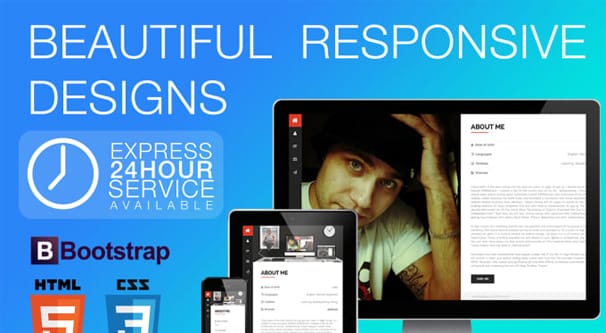
Types of Mobile Website
There are technically five different ways you can do a mobile website. Some are better than others, and you can tell by the title of this post that I’m going to recommend one over the others, but until then, you might as well learn about all of the options.
First is a mobile-friendly but not mobile-designed website. This is any website that keeps mobile in mind but does not cater to mobile devices. A mobile-friendly website is simply a desktop design that spaces elements far enough apart that it’s hard to fat-finger them. It’s simple and it’s easy to do, but it’s also not technically a mobile site. The user will still have to zoom in and out to read content, swipe around the page to view all of the elements, and it’s a hassle to navigate. For obvious reasons, this is the worst of the options.
Second is an adaptive website. An adaptive design essentially makes five or so layered versions of the website at different common resolutions. Different mobile devices will load different versions of the design depending on the size of their screen resolution. It’s harder to make than a mobile-friendly design, but easier than a responsive design. However, for people with odd devices, there might not be a design that fits perfectly, and you have to keep an eye on mobile devices hitting the market. If a new device comes out that doesn’t work well with your designs, you need to add a new one or adjust an existing one.
Third is a dedicated mobile website. You can see this in action quite easily if you visit a page like CNN, and then you check out their dedicated mobile site, m.CNN.com. The mobile site is dramatically pared down. It loads quickly, but lacks a lot of the trappings of a website that can help keep users around. It’s serviceable, but it’s a pain to maintain and it feels antiquated with so many better options available today.
Fourth is an AMP design. AMP is the Accelerated Mobile Pages code standard, and it’s been put into use by a handful of major websites. If you click a link to a website, typically through Google’s search results, and it doesn’t open in a new tab, but rather a new sub-app, it’s typically an AMP page. You can read all about this version here.
AMP designs are very fast and powerful for mobile. The problem is, they require you to code a new version of your page adhering to certain code standards, which often preclude many advanced web building features.
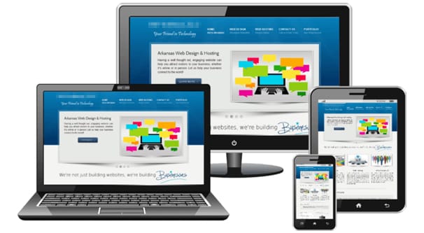
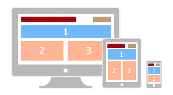
Fifth is a responsive design. Responsive is similar to Adaptive, except the entire page is fluid. It adjusts dynamically to fit any size of device, making full use of the space given to it and dynamically loading or unloading certain elements based on the size of the space allotted. You can see an example of this on sites like The Boston Globe. Simply drag your browser window around to adjust the size, and you will see the page adjust to fit the space given, avoiding any horizontal scrolls and unloading elements that aren’t useful on smaller devices, like sidebars.
Responsive design is my go-to recommendation for all websites. It allows you to keep the best elements of your site active as much as possible, while minimizing the amount of upkeep necessary. You don’t have to maintain a second mobile version of your site. A responsive design isn’t nearly as difficult to create today as it once was, either, so costs for development have gone down significantly.
The Cost of Responsive Design
Unfortunately, it’s pretty difficult to simply layer a responsive design on top of an existing website. Because of the way responsive design works, any “add a responsive design” app will be making a dedicated mobile version of your site on a different URL and redirecting mobile users to it. This defeats the purpose of having responsive design in the first place.
A true, powerful responsive design typically requires an overhaul of your website from the ground up. This is, unfortunately, usually pretty expensive. That said, there are a few ways you can do it for a lower cost.
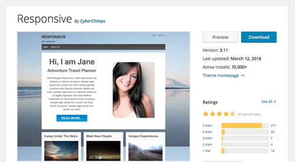
First of all, let’s consider that a huge percentage of the web is powered by WordPress. WordPress is not by itself responsive, and themes are not guaranteed to be responsive. However, an increasing number of themes are becoming responsive, including some designed with little else in mind.
If you don’t mind potentially changing the layout of your website, or hacking a theme together out of a responsive base and some custom CSS and HTML to make it look more like your initial design, you can fairly easily switch themes. Alternatively, you can use some fairly basic code to convert any existing theme into a responsive theme.
This is actually super cheap, since it’s a DIY option with whatever theme and framework you’re currently using. On the other hand, it requires having enough code knowledge to do it yourself, or paying a developer to make the changes for you. The only reason it’s relatively easy is because WordPress relies on a lot of very standard framing so various themes will work with each other. Since everything is standardized, it’s easy enough to make adjustments.
If you’re not using WordPress, you can still add code to make your existing site responsive. However, be aware that the more customized your code is, the harder it might be to make responsive. In some cases it’s as simple as adding dynamic adjustments to various elements and flagging some to unload as resolutions get smaller. In other cases, you may need to hack together a completely unique kludge.
If you’re converting an existing design into a responsive design, you have some good news. Since you have an existing design, you don’t need to spend as much on fresh web design, just on the programming and conversion of your existing site.
According to various quotes, the cost of web design can vary quite a bit. A small business with a relatively small and simple website, converting to a responsive design, might cost somewhere between $100 and $2,000 to put together. A larger, older, or more complex or custom design could run you anywhere from $5,000 to $30,000. Enterprise-level sites are obviously able to pay much more, and thus enterprise-level service providers charge more. The same basic service will vary based on the size of the business and the budget they have to pay for it.
Adding e-commerce capability to an existing site and making it responsive is where a lot of the cost comes in. Commerce sites are more complicated and need to be built to a higher standard, along with added security. You can expect an additional charge for an e-commerce platform, though how much that will run you can itself vary. I’ve seen anything from an additional $1,000 to $20,000.
There’s one piece of good news, and that’s for anyone looking to set up a brand new website. These days, responsive design is considered the standard for a new website. You can certainly find web designers who won’t make one, but most good web design companies will have a responsive design as standard. You aren’t paying extra for the responsive design, you’re just getting it as part of the package deal.
Is Responsive Design Enough?
One common misconception that I encounter fairly often is that simply having a responsive design is enough to satisfy the typical user.
For informational queries, that can be true. If all you’re doing is providing a blog with some tutorials and some editorials, sure, a responsive design is probably all you need. The user has one intent, which is to learn about what you’re writing about. All they need is easy to read access to your text. A responsive design satisfies that need.
For other queries, however, the user might have a task in mind. Maybe they want to purchase an item. Maybe they want to find specific information about a product or company. Mobile users often have a more fixated intent with a more immediate need. For example, someone might be out on the road looking for directions to the nearest open restaurant; if they can’t find your business hours right away, they’ll look elsewhere.
Mobile users also tend to be more easily distracted. Anything from a traffic light changing to a friend calling can put them off track and leave them ignoring you for later, which they might never come back to. Though, hey, guys? Don’t stare at your phone while driving, even if you justify it as being stopped. I’ve seen people catch a turn light changing out of the corner of their eye and gun it straight through a red light. That kind of shit kills people.
Digressions aside, mobile users tend to want to be in and out of your site a lot more quickly. You don’t have the luxury of attracting them with a blog post and getting them to stick around through a few more posts, casually dropping down your sales funnel. You need to front-load the tasks they’re looking for, be it informational or with purchase intent.
Another Alternative
Savvy web marketers consider the intent of their mobile traffic differently from their desktop traffic. Having a responsive design allows you to capture casual users who happen to be using mobile or a tablet to browse, but what about the focused users who have a specific task intent when reaching your website?
This is where a task app can come in handy.
Imagine if, when you visit a restaurant’s website, you’re prompted to download an app. The app has everything you need: access to your rewards program, an easily accessible menu, a page with store hours, location, and directions, and even the ability to make a reservation or place an order. Anyone immediately focused on performing one of those tasks will be more than pleased to have the app at their fingertips.
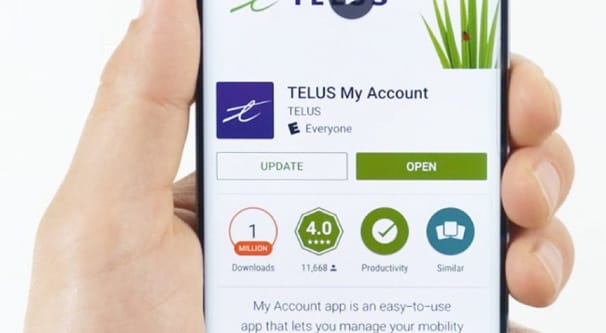
Now, I know there’s a lot of problems with having an app to handle all of this. For one thing, casual users might not want to load another app, particularly when many of the tasks aren’t relevant. This is why you never hide those features in the app, just make them more easily accessible to the users who are frequent customers or visitors.
An app also doesn’t satisfy Google’s need for a mobile friendly design. A responsive design – or some other version of a mobile page – is still necessary. Still, having a focused app can help supplement what a responsive design is starting for you. Something to consider, as you’re moving forward.