
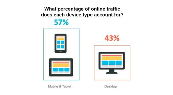
Over the last few years, as mobile device usage on the web increases and overtakes desktop web usage, Google has been making numerous large and small changes to encourage more mobile adoption.
Some of these changes are separate entirely from desktop rankings, while others affect both. Let’s look at what goes into mobile rankings and how they can impact desktop rankings.
Mobile Compatibility
First up, a quick definition. Mobile compatibility can mean many things for a website. You can have a dedicated mobile site, an adaptive design, a responsive design, or even a task app. Google prefers a responsive design, and have said repeatedly that it is their preferred format for mobile sites. The reason is that it is just one version of your website, so there’s no content division and no subdomains to keep track of. It’s also guaranteed to work on any device, new or old, because it responds to the size of the device accessing it.

Your site having a mobile-compatible design of any kind has been a ranking factor since 2015. Responsive designs tend to have more of a boost than other forms of mobile compatibility, all else being equal.
Page Speed
Page load times have been a search ranking factor for years. One noteworthy development is that Google is pushing mobile speed even more. Fast-loading mobile pages will be given preference in the mobile search index, just like faster loading pages are given preference in desktop indexing.
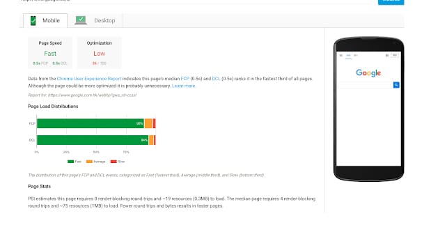
This is a new development because Google didn’t used to do this. In the past, just getting mobile compatibility was a big victory. “Mobile = yes” was a bigger influence than gradients between individual mobile sites. Now, though, mobile sites are more prevalent, so Google can start ranking them against each other instead of against a wasteland of desktop-only sites.
Page speed is still an either/or metric, however. A slow desktop site with a fast mobile version will benefit in the mobile index, but not in the desktop index, and vice-versa. With responsive design, however, it’s difficult to get one or the other, since both sites are the same.
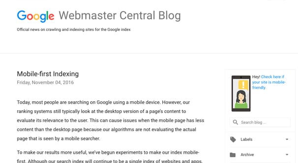
New: Mobile-First Indexing
The biggest change to Google’s search ranking in years, perhaps since Hummingbird or other major named updates, is the upcoming – or current? – mobile-first indexing change.
First announced in November of 2016, Google began something called mobile-first indexing in limited testing. According to their metrics, a majority of web users using Google are using it via a mobile device. At the time, and up until recently, Google’s index primarily focused on the desktop versions of the site. Having a mobile design was a benefit, but not necessarily a requirement. This led to a lot of instances where a site would rank well in Google for desktop, and would show up highly for mobile searches, but be virtually unusable on a mobile device. This, obviously enough, is not an ideal situation for Google. They don’t want to recommend sites with a poor user experience.
What this change means, according to that 2016 post, is that sites with responsive design are fine. Sites that have primarily desktop content should consider structured markup, AMP design, responsive design, or another adjustment to cater to mobile users. All users who do not have a mobile version verified in their Google search console should verify a mobile version of their site.
As of March 2018, Google has announced the next step of this whole process. They tested their mobile-first index for over a year and a half, and now they feel it is ready to be rolled out.
As of July 2018, Google has decided that mobile-first indexing should be the primary form of indexing for their search engine as a whole. It caters to a larger proportion of their audience, and thus it makes more sense to focus on it instead of desktop sites.
A few technical changes occur because of this shift. For one thing, the desktop versions of the Google search crawlers will be dialing back their frequency, while the Smartphone Googlebot – their mobile user agent crawler – will increase in activity. Additionally, when viewing a cached version of a page, Google will now save the mobile version rather than the desktop version.
Regarding AMP, even though Google has been pushing Accelerated Mobile Pages for some time, they are not giving it preference. Direct from the horse’s mouth, “For siets that have AMP and non-AMP pages, Google will prefer to index the mobile version of the non-AMP page.” What this means is that you don’t need to convert to AMP to succeed, but it will serve as a mobile version if all you have is a desktop and an AMP version of your page. A responsive design will still be better.
What this change does not mean:
- Desktop pages are not being removed from the index. Desktop-only pages will suffer compared to desktop/mobile hybrid pages, but it’s not a death sentence.
- Mobile-first indexing is NOT mobile-first ranking. If your site is not indexed as part of mobile-first indexing, it does not have a disadvantage against content that was indexed in the new fashion.
What this does is pave the way for Google to focus more strongly on the mobile web and to put desktop web on the back burner. The way I see it, this is the beginning of the end for desktop pages, however, desktop pages will not die off completely for at least another decade. Desktop usage is still too prevalent and still too important to ignore or penalize. I doubt Google will ever truly penalize it. Rather, the fact that more and more people use mobile devices as their primary devices, or even as their only devices, will gradually make mobile more important than desktop.
For the moment, more people still perform their shopping via desktop, due to how much more secure home networks tend to be rather than public Wi-Fi. Though, trust is gradually building and infrastructure is improving, so mobile e-commerce is growing just as much as mobile browsing.
Mobile Preference and Desktop Ranking
There are still two indexes of content moving forward, one for desktop and one for mobile. Running the same search on two different devices is likely to yield slightly different results, but not as different as they used to be. The reason for this is the widespread adoption of some form of mobile design. This reunification of the indexes has been a long time coming, as Google has repeatedly pushed the importance of mobile design.
For the most part, the search factors that rank you on the desktop search are the same as what will rank you on the mobile search. Good quality content is platform-agnostic, for example. It doesn’t matter if your broken script is broken on one platform or the other, it still hurts you.
In general, there is nothing desktop-specific that will affect your mobile-specific rankings, and vice versa. At least, nothing direct.
There are, however, many indirect factors that can lead to bleed-over between the two different indexes. For example, bounce rates. If you have a slow or poor mobile site, perhaps one using an m.domain or with a slow, poor redirect method, you are going to have more users – generally mobile users – bouncing from your site. Bounce rates can be a search ranking factor. Of course, bounce rates are difficult to quantify and aren’t used as a powerful ranking factor, so this could be minimal.
Having a responsive design is Google’s preferred form of web design today, and has been for the last half a decade. As long as mobile devices come in a variety of different screen sizes, from watch-sized to tablets, responsive design is going to be the best way to serve everyone equally.
Best Practices
Google lists a number of best practices when it comes to mobile design, moving forward with their mobile-first indexing in mind.

Let’s go over the important points.
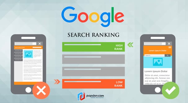
- Desktop-only sites are going to perform worse than hybrid or responsive sites, due to losing out on mobile traffic. This is unchanged in the current mobile-first index compared to the previous index method.
- Responsive design sites are going to perform better in both indexes than sites with no responsive design. The mobile version will be indexed, but since the mobile and desktop versions are the same, this is a meaningless distinction. This, as well, is unchanged from the previous indexation method.
- Sites that use AMP pages as canonical pages will have those versions indexed preferentially. This is likewise unchanged from the past. AMP is not required to succeed and AMP is not given preferential treatment over responsive design.
- Sites that use m.domains and redirects will see a slight change. The mobile version of the page will be given preferential indexation, including the mobile version showing up in Google’s cache. This does not change current rankings on either index.
- Sites using adaptive design will be similar to m.domains, in that the mobile version – or the most commonly accessed mobile version, if several are available – will be given preference in the index. This again does not affect rankings.
- Sites using AMP and non-AMP pages with no canonicalization will have the mobile non-AMP version given preference in the index.
As for the actual best practices, Google has a lot of advice, though a lot of it boils down to “make sure you have a mobile design” and “we prefer responsive design, but anything is better than nothing.”
First of all, both desktop and mobile versions of a site should contain the same content. Some sites use different versions of content, which is going to cause issues and changes with ranking and indexation. Moving forward, mobile versions are treated as the primary version, so if your mobile content is pared down or less valuable, it will hurt your search ranking.
If you use Google’s structured data system, the structured data markup should appear on all versions of your site, both mobile and desktop. This is already easy on responsive designs, because there’s only one design, but for separate adaptive or m.domain sites, you will need to make sure markup is present in all versions.

Meta data should not be ignored or changed between desktop and mobile. You can make minor changes to cater to the type of device the user is using, but otherwise the essence should be the same.
If you use separate URLs for desktop and mobile, you need to make sure that your mobile site is verified in the search console. If you aren’t verified, Google might not recognize that you have an official mobile version of the site, and you might suffer from lower ranking because of it.
You might also consider making the mobile version of your site the canonical version and the desktop version as the alternate, if you use rel=alternate tags on your separate domain. This is a minor change and should not be important yet, but it could be considered a form of future-proofing. Only do this if your mobile design is fully featured, however.
Does Responsive Design Effect Desktop Rankings?
The real question of whether or not responsive design effects desktop rankings is largely unanswered. Numerous case studies have been performed to show that responsive design ranks better than no mobile design at all, but the answer is generally inconclusive. Responsive design is Google’s preferred design, but Google’s preferences don’t determine rankings. Responsive design does, however, make your site more usable by more people, which is an indirect benefit on several aspects of SEO. User experience is a big benefit to responsive design, for example.
At this point, essentially, a responsive design absolutely cannot hurt your ranking, and can potentially help you out moving forward. There’s no reason not to have one by the end of 2018.